
2021 21- Day Racial Equity & Social Justice Challenge
Created:
April 2021
Project Duties:
Campaign Strategy
Email Design
Copywriting & Copyediting
Document Design
Donor Engagement
Social Media Design & Strategy
Press Engagement
Web Design
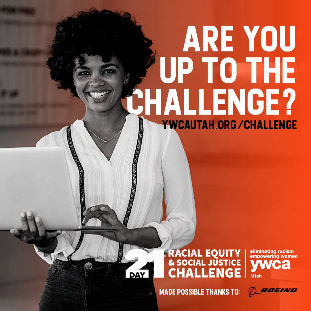
Following the success of the inaugural YWCA Utah 21-Day Racial Equity & Social Justice Challenge, launched in the summer of 2020 in response to the national reckoning with race and racism, the Challenge returned the following summer. Boeing had signed on as the first-ever sponsor of the campaign, expecting a high level of execution of content, design, and implementation.
It required creating social media graphics, responsive emails, learning materials, web-based resource kits for businesses, a Facebook frame, and more. I also oversaw the copywriting for press efforts, promotional materials, and content summaries for 21+ emails, guiding a team through the process.
Process Documentation
As a result of Boeing funding, I was able to hire two interns to assist in implementing race equity communications initiatives. This necessitated a more formally documented process for copywriting, editing, design, and construction of emails. I detailed a complete process pipeline, including best practice tips, special use cases, and training on achieving consistent tone, branding, and user experience.
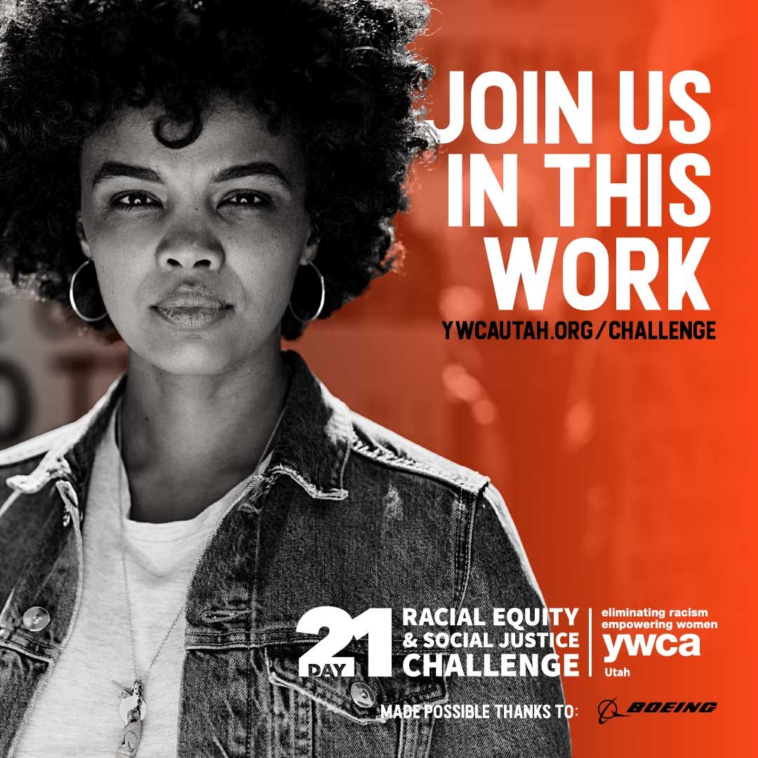
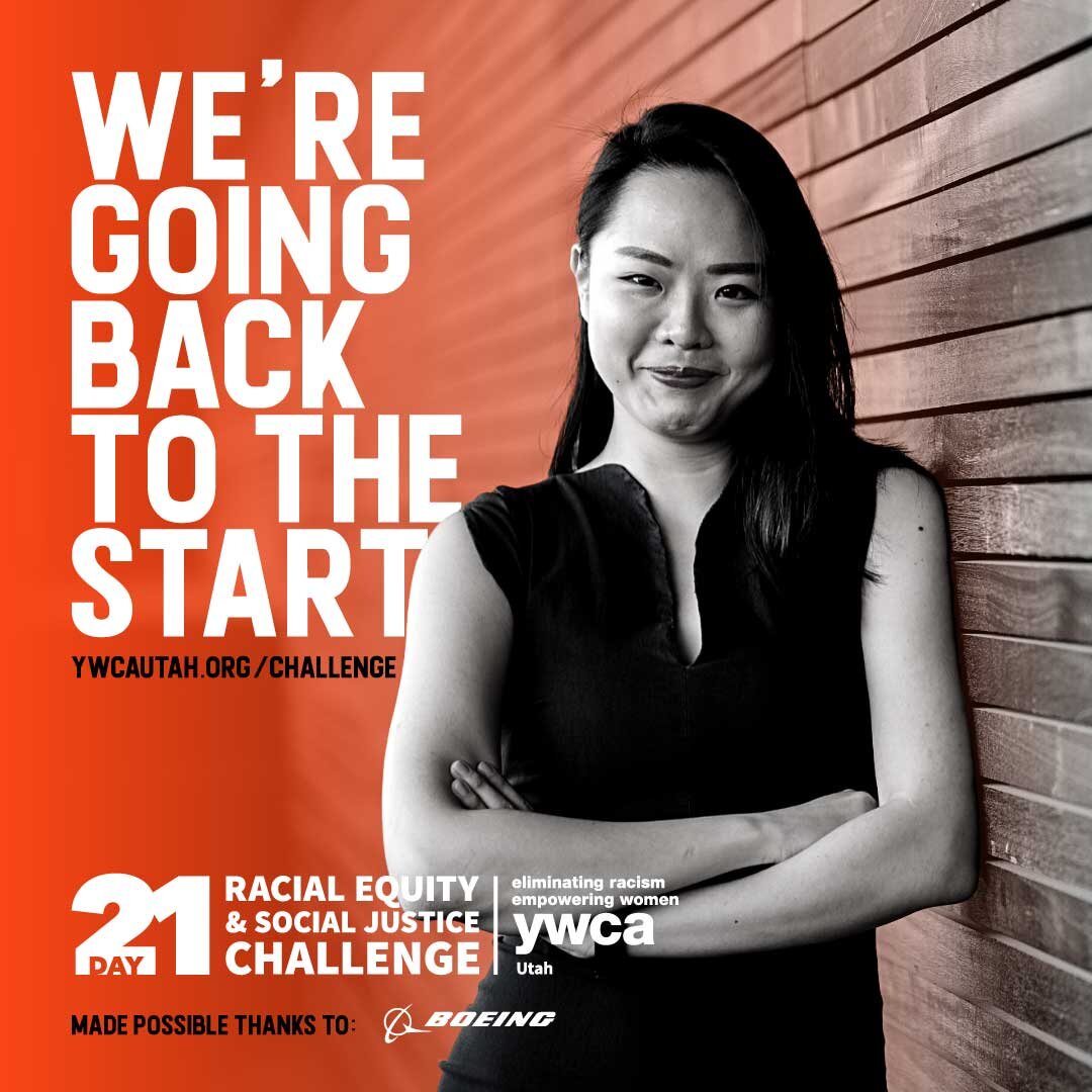
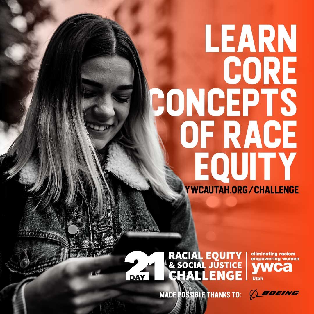
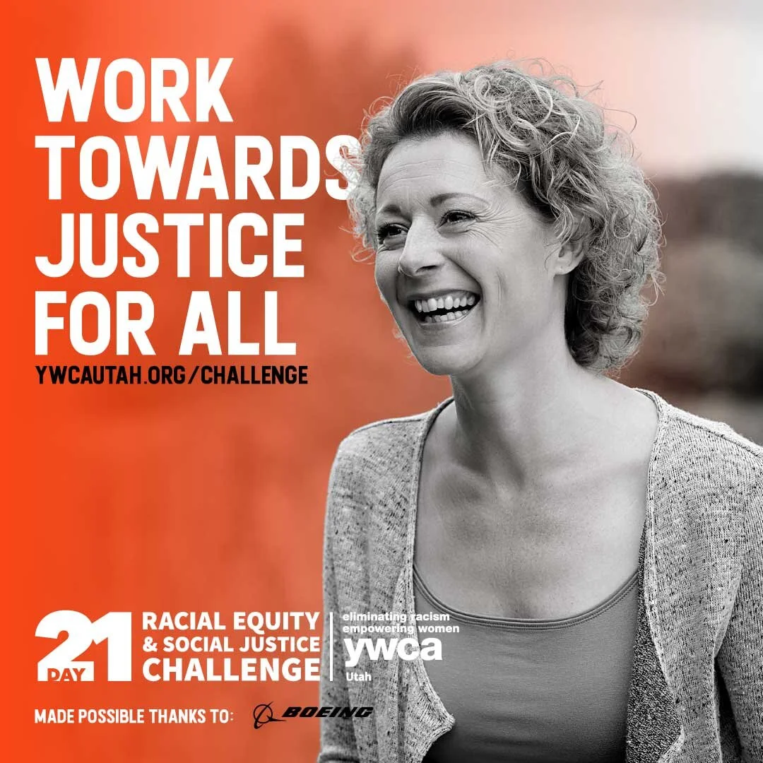
Design Process
When designing the 2021 Challenge, I wanted to stay true to the work completed in 2020 while also updating it to reflect the current trajectory and tone of the organization and overarching culture. A few changes included:
Updating typography to differentiate the program from regular YWCA communications. The font used, Cavalier Bold, mimicked the lettering often found on protest signs during the Civil Rights Movement and Black Lives Matter protests in 2020.
Updating the color palette to fully adopt the signature YWCA persimmon, which was previously used for Challenge graphics at semi-transparency, diluting the dramatic, striking effect that lends itself well to the campaign.
Rotating imagery throughout the Challenge to keep the look and feel of the campaign dynamic, bearing in mind that individuals would receive daily emails. This allowed the user to differentiate between days and keep them engaged.
Copywriting & Copyediting
In collaboration with the CEO, content was curated from various sources across the internet for the Challenge. Each of the 21 emails contained at least three sources, which required short introductory summaries and an accessible, concise introduction of each day of content. I created a content checklist, ensuring that several non-communications staff wrote content that met our standards. After the internal workgroup completed their first pass, I copyedited nearly 5,000 words of copy regarding complex race equity topics to ensure a consistent brand tone and messaging congruent with the organization's approach to race equity work.
Creating a Learning-Focused Campaign
Drawing on my experience from the 2020 campaign and contracted work for one of the higher education institutions in the state, the 2021 campaign was fine-tuned to be more engaging for both participating individuals and companies.
I designed, formatted, and distributed an improved reflection log for participants and a web-based resource guide for companies participating in the Challenge.
Initial discussions amongst leadership pushed for a static, PDF version of the group toolkit. I argued for and quickly drafted a proof of concept for a web-based version for the following reasons:
Flexibility updating links, graphics, and language at any time
Easily navigable as a menu with id-tags and accordion content organization
Ability to track the number of times a group toolkit is accessed
Ability to capture usage and demographic data through Google Analytics


