YWCA Utah 2020 Annual Report
Created:
December 2020
Project Duties:
Document Design
Copywriting & Copyediting
Fundraising Strategy
Story & Data Sourcing
Iconography
Chart Design
Objective:
As part of broader rebranding efforts, YWCA Utah needed to revitalize its annual report to capture the new spirit of the YWCA, accurately reflect key financial data, and restructure fundraising strategy regarding messaging, categorization, and reporting metrics. The 2020 Annual Report needed to capture the transition of leadership, communicate unique circumstances around COVID, and serve as an encompassing representation of programs, impact, and strategic direction for donor stewardship, grant applications, and financial transparency requirements.


Rethinking Fundraising Strategy
Throughout 2020, it became especially salient that our current categorization system did not convey the full breadth of services, ideals, and programming at the organization. As programs, particularly race equity programs, quickly expanded, the boundaries between categories began to blur.
I proposed simplifying our fundraising strategy by clearly identifying our focus areas rather than maintaining an ambiguous “three-bucket” approach. My reasoning was as follows:
Room for expansion of growing programs in new focus areas
Clear communication at a glance of our values, services, and programs
Straightforward navigation on the website once fully implemented
Space for new programs to receive recognition, rather than compete in the same category with well-established programs
Design Process
As a result of several major transitions, it was fitting that the Annual Report, which I view as a primary piece of fundraising collateral, reflected a modern, bold feel as the organization started a new chapter. This was achieved in the following ways:
Color Palette
The color palette for the report featured the signature orange and shades of grey. Rather than shy away from the signature YWCA persimmon, which had been deemed “too aggressive,” I leaned into its sharp contrast. With several non-profits in the area known for their signature color, I wanted to shift the YWCA in that direction.
Iconography
I curated and refined consistent iconography to quickly communicate core statistics and information. While the YWCA had used iconography in the past, many previous Annual Reports were more word-heavy, making them more difficult for fundraising efforts.
Design Motifs
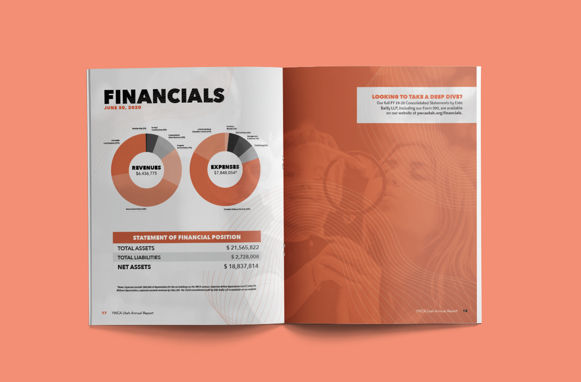
I developed a consistent design motif throughout, featuring sharp contrast spreads and flowing line art to balance. This included shifting away from a muted color palette for charts, which often did not have proper contrast ratios and did not effectively highlight key data points.
Telling a Compelling Story
The past year was exceptionally complex for YWCA Utah. The previous CEO, tenured for 20 years, stepped down in April 2020, only one month after the onset of the pandemic in Utah. Several other leadership team members departed over the following months. We saw an increased strain on our services, staff, and community as a result of COVID. I wrote all copy for the Annual Report, including the CEO address, new fundraising area descriptions, and more. I also identified opportune reporting metrics that we could leverage over the year for fundraising and grant applications, extending the life of the Annual Report.

